Rainbow Festival Brand Identity
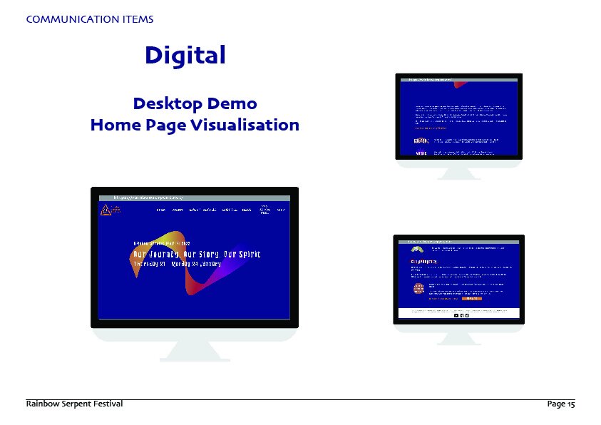
This project is to build a brand identity package for the Rainbow Festival which including all the contents that a brand is going to use, such as logo, color plate, typography, poster, and ticket. The Rainbow Festival is an electric syllable inherited from Australian Aboriginal culture, so the creative idea of this project is to combine Aboriginal culture with modern art. In the design of the logo, the tent shape representing the indigenous culture and history is adopted, which is also inspired by the symbols in the indigenous culture. In the design of the brand image, a rainbow shape is adopted to fuse a variety of colors, which is mainly to highlight the characteristics of the electric syllable, vitality, youth and electronics. In the meantime, remain some shapes from the Aboriginal culture to keep the culture and history.


